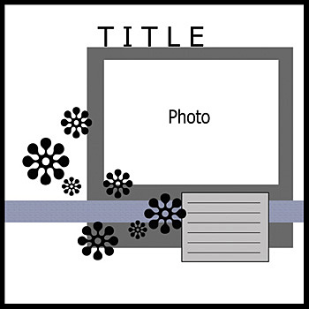
Ready to get this challenge going? I'm sure you've noticed the sketch in the sidebar... and maybe drooled a little over what we've got in the Idea Gallery. So I'll cut to the chase already!
 |
| Tammy Harp |
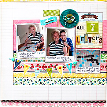 |
| Melanie Call |
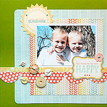 |
| Jennifer Moore |
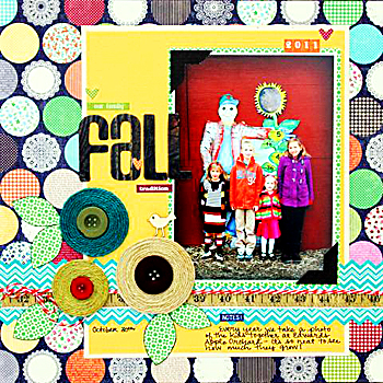 |
| Brenda Carpenter |
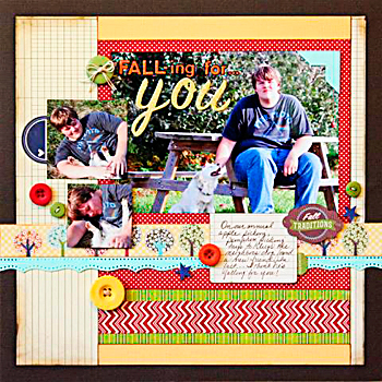 |
| Beth Hallgren |
|
|
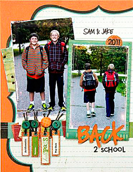 |
| Theresa Sovacool |
Inspired? Ready to make some paper fly? Have a handful of embellies ready to throw down? Link up your layout here by September 30th for a chance to win a $10 gift certificate to the TSR Store!
Um. Why are you still here? What are you waiting for?! Oh, winners from August? I think I won both of those challenges. Thanks for playing anyway! *giggle* Just kidding.
For the August Sketch Challenge,
scrappy_granny won with this precious layout. Love the butterflies and pops of pink! The Jillibean Soup paper is a great choice for garden photos.
For the August Page Starter Challenge,
Deanna won with this beautiful layout. Kickin' way to use that Prima paper, Deanna - it's perfect!
Congratulations ladies! Please
email Tammy at admin@scrap-room.com with your real name, address, and
the name of the contest you won. She'll get your prizes to you right away. Happy shopping!
NOW... go get your scrap on!


Both are great layouts! Congratulations Barbara and Deanna!
ReplyDeleteCongrats Barbara and Deanna! Both are super awesome picks!!!
ReplyDeleteTHANK YOU!!!
ReplyDeleteCongrats Deanna :-)
I had fun with this sketch.. thanks!!
ReplyDeleteCongrats Barbara & Deanna, thanks for another fun sketch TSR.
ReplyDeleteHaving problems getting the linky widget to work but here is a link to my layout.
ReplyDeletehttp://www.scrapbook.com/galleries/543231/view/3740583/-1/1.html
http://www.scrapbook.com/galleries/543231/view/3740597/-1/1.html
ReplyDeleteThis is the correct entry for your sketch, #8 entry was wrong, I apologize, but still having problem with the linky widget
Congratulations, Barbara and Deanna!!
ReplyDeleteI really like this sketch - so clean and simple! I just uploaded mine using the June 2012 PB&J. :)
Hey, no worries, Barbara G! I removed the entry you had in #8 for ya. :)
ReplyDeleteThanks for the sketch! I made a few changes--I had to move the flowers to the other side to make room for two more photos I wanted to use. I also thought my page looked a little bare (in part because I used white paper in order to ink a plaid background that matched my daughter's plaid Easter dress). As a result, I added more embellishments. I also entered this layout in another challenge that encouraged me to use a 5x7 or larger photo, which I hardly ever do!
ReplyDelete