Saturday, October 31, 2015

November Sneak Peek #6


SIMPLE STORIES WE ARE... FAMILY
Layout by Simple Stories designer, Amy Coose, and found on the Simple Stories Blog. This fun line is the second one revealed for our November 2015 DoubleShot Kit.

 Document your favorite family memories with We Are...Family.  Bright colors, flirty florals and loving sentiments paired with dark wood & embroidery accents are sure to make this a 'go to' collection.  There's no place like home when youre creating with We Are...Family! -- Simple Stories Blog.

Friday, October 30, 2015

November Sneak Peek #5

PHOTO PLAY PAPER AUTUMN DAY
Autumn Day is a fantastic line by a new scrapbooking manufacturer, Photo Play Paper.  The image above is part of the Autumn Day line's sticker sheet and an icon found on the Photo Play Paper site.

Crisp air, falling leaves, and colorful pumpkins tell us that autumn has arrived! Our new line, Autumn Day, will help you celebrate all that the season brings, from cozy little moments to warm memories of gathering with the family to give thanks. Plaids and stripes, elegant damasks, and charming autumn graphics are a perfect complement to your fall photos. Grab a mug of cider and get ready to scrapbook a perfect autumn day. -- Photo Play Paper site.

Thursday, October 29, 2015

November Sneak Peek #4

BASICGREY SUN KISSED

Layout by BasicGrey designer, Lisa Dickinson, and found on the Basic Grey Blog for our November 2015 DoubleShot Kit.

Like everything touched by the sun, the patterns and colors of Sun Kissed are naturally sweet and oh-so pretty, just in time to scrap those end-of-summer memories.  -- Basic Grey Blog.

Wednesday, October 28, 2015

November Sneak Peek #3

BELLA BLVD. FAMILY FRENZY

Layout by Bella Blvd. designer, Laura Vegas and found on the Bella Blvd. blog.

It's undeniable that families today are busy, busy, busy. Everyday there is something to get accomplished or somewhere to be, and then it starts all over again. Family Frenzy from Bella Blvd was inspired by the chaotic and randomness that makes us a family. From donut treats on Saturday mornings to bike rides and family games we've got it covered in this bold everyday-inspired color palette. -- Bella Blvd. Blog

Tuesday, October 27, 2015

November Sneak Peek #2

PINK PAISLEE CEDAR LANE

Layout by Pink Paislee Guest Designer, Jana McCarthy, found on the Pink Paislee Blog.

Complete with rich hues, gorgeous florals, and the perfect autumn color palette; Cedar Lane will compliment each and every moment! -- Pink Paislee Blog


Monday, October 26, 2015

November Sneak Peek #1

BASIC GREY TYPESET


Layout by Basic Grey Designer, Lisa Dickson, found on the Basic Grey Blog.

With a fresh twist on retro appeal, Typeset is a remix of nostalgic patterns and classic floral charm. - Basic Grey Blog

Sunday, October 25, 2015

Please Join Me in Thanking Heather Robertson

...for a wonderful three months.  Here is one last look at a beautiful page of Heather's featuring her "lovely" daughter.
The dreamy backdrop is the backside of the floral paper from our Pink Paislee Documentary collection in The ScrapRoom's October 2015 Patterned Paper Kit.

Heather provided some gorgeous designs and wonderful tips in the past three months.  We have enjoyed working with her and seeing her unique ideas.  Thank you, Heather.

Saturday, October 24, 2015

Re-Examining Your Creative Process: Making the Most of Your Patterned Paper


Some of my fondest memories of the first few years after high school involve this group of girls.  It is amazing how quickly you can bond when you're all thrown into a new place and not knowing anybody.  I'll always have a special place for everyone on this page!

The pink and green are our Delta Zeta colors.  When I saw the The ScrapRoom's July 2015 Patterned Paper Kit, (still available BTW), I was hoping to find a picture from sorority to take advantage of the wonderful, bright papers included in the patterned paper kit from the Pink Paislee Citrus Bliss line.

Brenda Carpenter's Patterned Paper Series notes are below:


4. Think 2/3 Pattern to 1/3 Solid.  To maintain a good balance of colors and patterns in your layout, compose the design with 2/3 of the patterned paper to 1/3 of the cardstock.  When doing a 12 x 12 sized layout, trim the paper to 8 inches in length and build your design from there.

Note also the use of the contrasting photo corners, adding impact to the layout and drawing the eye to the photos and away from the "busy" patterned paper. (See #1 from October 13ths post.)

"College Life" [12 x 12 inch layout]  - using notes from Brenda's class adapted for my Pink 
Paislee Citrus Bliss layout.

  • 4.75 x 6.75 inch photo matted in pink cardstock, finished at 5 x 7 inches.
  • Base of layout -- Green cardstock.
  • Trim 8 x 12 inch of pink patterned paper.
  • Trim 6 x 11 inch section of green paper and round edges. ( I actually used 6 x 4 inches.  I cut it as 6 x 3 and 6 x 1 inch, and tucked the edges under the pink to be frugal.)
  • Cut a 4.25 inch diameter circle out of white cardstock for the title.
  • Punch or cut photo corners out of Pink Paislee Citrus Bliss Seeds.
  • Trim 9.75 x 5.75 white cardstock for journal box. Matte with 10 x 6 inch lime green cardstock.
  • I used a die cut for the title circle border.  Brenda instructs to "Create 8 ribbon tabs to border the title circle."
  • Add additional embellishments to your liking.
We are almost half-way through the Patterned Paper Series.  Have you liked it?  Are you using the instructions?  Should I continue?  Thanks, in advance, for any feedback.

Friday, October 23, 2015

Wrapping Up October's Freaky Fast Friday

Today wraps up the October Freaky Fast Friday with a fun Halloween themed page from Brenda Ragsdale!


Brenda created her layout with Carta Bella Trick or Treat from the October 2015 DoubleShot Kit.

We are bringing back a challenge that was run at The ScrapRoom a few years back.  Here's how it works.  Each month, we will introduce a basic formula to use to get a page done.   They will be simple instructions to choose a base paper to start your page along with instructions to cut pattern papers to complete a page. It's that easy!! Tammy's kits are perfect too,...just grab a bag and you're ready to go!

This month, we are even able to offer up a prize to one of our subscribers who participates:

 Simple Stories Life Documented Day to Day Card Set

You may enter your own version for a draw for the prize on any of the Freaky Fast Friday posts in the comments section by anytime on 11/5/15. Please link up your page to a blog or photo-sharing site. Presently, your odds at winning are pretty strong.  ;) 

Let's look at this month's formula... 
  1. Cardstock or subtle patterned paper background 
  2. 9"x 5" patterned paper
  3. 10"x 6" patterned paper
  4. 10"x 3" patterned paper
  5. 11"x 3" patterned paper
  6. 11"x 1" strip patterned paper
  7. 11.5"x 1/2" strip patterned paper
It's as easy as 1,2, 3,...(and 4)!!
1. Collect as many pictures as you like.
2. Cut your patterned paper to the dimensions stated above.
3. Push the paper around your cardstock till you achieve the look you want, or simply lift one of the layouts below!
4. Adhere and EMBELLISH! It is that easy!!

 And, here's a recap from the prior weeks:

Grateful for These 2

Rochelle Spears created her layout with the Simple Stories Pumpkin Spice line from the October 2015 Flavor of the Month kit.

Fall Visitors

Heather Robertson created her layout with the Simple Stories Pumpkin Spice line from the October 2015 Flavor of the Month kit.

Grateful

Tammy Harp created her layout with the Simple Stories Pumpkin Spice line from the October 2015 Flavor of the Month kit.

My Fave

I created my layout using the Dear Lizzy Documentary line from the October 2015 Flavor of the Month kit.

Thursday, October 22, 2015

Daily Inspiration: Layout of the Day!

Fabulous, right!?! Rochelle Spears created this masterpiece with the Pebbles Harvest line from the October 2015 Doubleshot Club Kit.

Tuesday, October 20, 2015

Re-Examining Your Creative Process: Making the Most of Your Patterned Paper


The photograph of this layout was very difficult to take.  The photographs were developed onto a glossy film and it took a gazillion tries before getting an image without glare. The final result was a photograph taken of the layout in a darker area.  As a result, the colors aren't precisely true to form as I brightened it up the best that I could.  The Pink Paislee Memorandum paper has a deeper light color than it appears here.

Although I like the layout a lot, it doesn't exactly use the same design principles as Brenda Carpenter's.  I ended up lifting her layout this time more than reading through her notes first.  But I will address that more later.  In her sample, your eyes are drawn right to the center because of the patterned paper that she used.  Let's look at what she had to say, shall we:

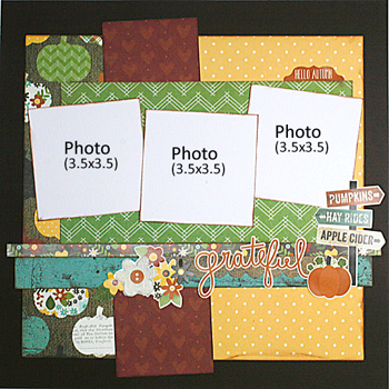
2. Make the Middle Work for You. Another way to use large patterned paper is to cut it up and use it in the middle of your layout.  Have the design work for you by taking shapes and colors from the papers for your accents. Here I used the circle and star elements for the title block and embellishments.

3. Use Patterned Paper for Your Title.  You can stamp on patterned paper and cut out the letters.  You can also use a die cut tool to create a title with the paper, (see "superstar" card - {which I, Janine, cannot find-so I cannot show it to you}) This is a great way to use up extra scraps of paper and bring another color to the design.

Note the use of the small strip of solid paper to break up the two patterned papers. This principle was first discussed in last week's lesson. Below, (actually above here), is another example of that principle.
------

I would like to address what I did differently and how I believe it impacted the impression on the viewer.  As you look at Brenda's layout, try to notice where your eyes begin and how they move on the page.  Then, do the same with mine.
Here's what happens to me on Brenda's page.  My eye is immediately drawn to the center with the busy patterned paper. I glance at it quickly and move to the title and then the matted photograph to the right, where my eyes linger.  I, then, find myself looking up to the picture at the top.  At the end, my eyes are most drawn to the matted photograph, the highlight of the page.

On my page, all of my eye movements go in the same direction, (counter clockwise), but they start at the matted photograph. I end in the same spot.

Both pages use two visual triangles. (Brenda talked about visual triangles last week.)  Brenda's includes the two pictures and the journal box as one, three stars close together in the center as the second.  My page includes the three photographs as one, and the three black embellishments as the other.  In Brenda's, I find that the focus is left more into the center with a more micro or local approach.  On my layout, I find the focus expanding out to the farther reaches of the page due mostly to the placement of the embellishments.

You can see some great similarities to both of the layouts.  Both layouts bring most of your attention to the matted photograph.  The bold and bright colors surrounding them add to the eye being drawn to these larger photographs. This is, generally, the main feature on each page.  Everything else on either page supports the main feature.  Also, as I mentioned, in both layouts your eyes move in the same direction.

However, there are differences related to the papers, colors and embellishments on each page.  On Brenda's page the bright colors, busy pattern, color play and photograph in motion all have the presence of a lively page.  You imagine her toddler in constant motion and growing bigger with her use of fonts and his poses.  On my "Back to School" page, the boys are posed and subdued.  The added "yay" almost feels sarcastic.  :)  The black letters further add to the lack of festivity of the occasion.  The stars and dots, however, cheer up, (a little), the much more quiet page.

I hope that you are enjoying these series.  I welcome your comments and added observations.  Next week, I will add one more lesson to this series using Pink Paislee Citrus Bliss.  Hope to see you then!

Monday, October 19, 2015

Daily Inspiration: Layout of the Day!

Heather Robertson created today's featured layout with the Simple Stories Pumpkin Spice collection from the October 2015 Flavor of the Month kit.  There is so much to take in on her layout.  But my favorites are the block lettered title on her photograph, the twine frame and the cute cluster made with stickers from the kit:


Saturday, October 17, 2015

Project Life Inspiration: Sketch Book

Hello TSR friends! Today for my Project Life post, I'd like to offer you another set of title card sketches. File these away under quick and easy.


I think I am going to print out all of the Project Life sketches that I have created (and saved on Pinterest).  A binder of sketches will help me "Get more pages done!"

Friday, October 16, 2015

It's FREAKY FAST FRIDAY!!!

Let's all hear some noise! (Crowds in roaring cheers.) :)

Are you ready for another installment of Freaky Fast Friday? Have you created yours yet?  If not, (or even if you have), feast your eyes on today's wonderful version created by Rochelle Spears:


So what is all the hubbub about?

We are bringing back a challenge that was run at The ScrapRoom a few years back.  Here's how it works.  Each month, we will introduce a basic formula to use to get a page done.   They will be simple instructions to choose a base paper to start your page along with instructions to cut pattern papers to complete a page. It's that easy!! Tammy's kits are perfect too,...just grab a bag and you're ready to go!
This month, we are even able to offer up a prize to one of our subscribers who participates:

 Simple Stories Life Documented Day to Day Card Set

Let's look at this month's formula... 
  1. Cardstock or subtle patterned paper background 
  2. 9"x 5" patterned paper
  3. 10"x 6" patterned paper
  4. 10"x 3" patterned paper
  5. 11"x 3" patterned paper
  6. 11"x 1" strip patterned paper
  7. 11.5"x 1/2" strip patterned paper
It's as easy as 1,2, 3,...(and 4)!!
1. Collect as many pictures as you like.
2. Cut your patterned paper to the dimensions stated above.
3. Push the paper around your cardstock till you achieve the look you want, or simply lift one of the layouts below!
4. Adhere and EMBELLISH! It is that easy!!

 And, here's a recap from last week:

Fall Visitors

Heather Robertson created her layout with the Simple Stories Pumpkin Spice line from the October 2015 Flavor of the Month kit.

Grateful 

Tammy Harp created a wonderful Fall layout with the Simple Stories Pumpkin Spice line from the October 2015 Flavor of the Month kit.

A Memory Fave!

I played along using Dear Lizzy Documentary from the  October 2015 Flavor of the Month kit.

Hope that you will play along and submit your project in any of the comments below a Freaky Friday post for a chance to win.  Have a super weekend!!

Thursday, October 15, 2015

Heather's Tips: Getting Creative With Photos

Getting Creative With Photos
One of my favorites things to do is alter the photos I place on my layouts.  I love to turn them to black and white, to recolor them, to change them into sketches, to add text, and especially crop them in unusual ways.  I think it really adds interest to a page. Now that I have digital images I don’t worry so much about destroying a photo when I cute - I can always reprint the photo.

I use Adobe Photoshop for all my editing but I’m sure similar options are available in other editing software. I know my daughter has a lot of fun using her iphone features to distort and add cool effects to her photos.

Probably the easiest thing to start with is to add text to a photo - you can write directly on it with a slick marker , use rubons, stamp (very carefully) with quick drying pigment ink or add the text in an editing program before printing.

Adobe PSE has numerous filters which make photo editing very artistic.  The one I mainly use is Sketch.  Using  photos with not too much detail works best.  You can adjust the amount of dark and light you get,  Here’s a page where I turned the photo of my friend and our dogs on the beach into a sketch.

Cropping doesn’t have to be complicated or fancy.  Simple shapes like circles, triangles , tag shapes or chevrons are effective or even cutting a rectangular photo into different sized strips adds interest. For a fun or funky page try cutting a photo into an irregular shape or cut out portions and substitute that bit of photo with patterned paper.  Corner rounders, diecuts and other punches can alter the shape of your photo easily.

For this page I hand cut the photo into a simple banner shape

When I’m cropping a photo in an unusual shape I will open it in Adobe Photoshop.  Then I can mask it with whatever shape (s) I like, I can move the photo around so that specific parts of the photo are visible and resize as necessary.  When I have the desired image I print and cut.

For this page I created a hexagon mosaic for the photo to match the pattern on the paper.
Here’s a tip for creating a mosaic of a photo.  I normally have the background color be the same as my page.  After I print I cut only around the outer edge of the image, not the individual sections. It’s easier and you don’t have to reconstruct all the little pieces on your page

Try making a large title for your page where the letters are actually photos -  very striking.

Tuesday, October 13, 2015

Re-Examining Your Creative Process: Making the Most of Your Patterned Paper


My crew, today and everyday.  According to a study done by the Harvard Health Watch, an average American spends 101 minutes per day driving. Not sure what it is for us.  But, being that this is my view of these guys for some portion of everyday, I wanted to document it.

I went back to our paper pattern series to help me with these photos.  Notice the direction that my boys are looking....fairly similar to Brenda's page.  It, generally, looks best when eyes in photographs are looking into the page rather than off page.  One exception may be a contemplative page where thoughts wander.  In that case taking the eyes off page sort of fits.  But, I digress.  Onto Brenda's notes:

(Week Two from her series) 1. Use Patterned Paper as the Page Base. When using a large pattern that covers the entire sheet of paper, one method is to use it as the base for your layout. Because the pattern on the green polka dot is so small, it reads as a solid color on the layout and the photos stand out.  The blue cardstock border adds a pop of color that helps break up the design and put the focus on the photos.  Adding solid cardstock photo corners provides impact to the layout, drawing your eyes to the photos and away from the "busy" background paper.


"My Crew": (12 x 12 inch layout) - using notes from Brenda's class adapted for my Pink 
Paislee Memorandum layout.  One more note regarding my adaptation. Although my triangle base sheet does not necessarily fit the description of a "large pattern" in the way that the initial Fancy Pants sheet does with its' pattern of circles and stars cascading diagonally down, I would consider it busy and bold.  I believe Brenda's rules do apply just as well to such a pattern as this.
  • Photo sizes used -- (measured with white matte from photo paper, starting top left and moving clockwise) 4.25" x 5.75", 4.1" x 5.75" and 4.25" x 5.5"  (Brenda's added circles are 2 inch diameter).
  • Start with triangle paper from patterned paper kit as base.  You will be covering up most of this paper, so make sure you cut out the inside to use on other designs. (I, actually use my cut out piece on my next project for this patterned paper series which will be shown on the blog next Tuesday, October 20th.  It measures 9.5" x 7".)
  • Trim red polka dot paper to 10 x 10.75". (It is the back of the clipboard sheet from the October Flavor of the Month Kit called Cubicle.)
  • Trim blue cardstock to 10.25 x 11 inches and adhere flush with the right edge of the page,
  • Punch or cut photo corners and star out of yellow cardstock.
  • Assemble page as shown.
  • Add title and embellish.
One last tip from Brenda C.: Also note the "rule of thirds" in use on this layout - the two yellw photo corners are balance by the yellow star, and the two circular photos, (note Brenda's example), are balanced by the circular journaling block.  Using embellishments or accents in groups of three really helps balance the design.  The visual triangle is something that "I", (again this is coming from Brenda but I do this often as well), use in practically every layout that I create.

Monday, October 12, 2015

Daily Inspiration: Layout of the Day!

Brenda Ragsdale created today's fabulous, featured page from the Pebbles Harvest line found in the October 2015 Doubleshot Club Kit.  I love how she used the apples to make a "Back 2 School" page! The apple paper is on the opposite side of the green paper shown in the TSR kit collection.  The darker green paper, shown here, is on the backside of the flower paper from the TSR October 2015 Doubleshot Kit collection.

Sunday, October 11, 2015

Introducing Guest Designer Lisa Lahiff

We are SO very excited to be bringing another Quarterly Guest Designer to The ScrapRoom. Lisa is sure to inspire you with her wonderful layouts and magnificent cards.  We are thrilled to have her join us for the next three months.


Let's get on with the interview, shall we?
How long have you been scrapbooking and how did you get started?

I started scrapbooking in 2005, right before I became engaged to my husband.  It seemed to work out perfectly as I had lots of big moments and important photographs I wanted to keep safe and have on display.  At first I did the very basic pages with photo mating and a few sticker embellishments, until I discovered scrapbook magazines and blogs that really set my imagination soaring. 
Describe your scrapbooking style.
   I don’t like to label myself to a specific style as I feel it sometimes makes me feel limited or stuck, but I do tend to craft with a more clean and simple approach and I love mixing and matching patterned papers.


Favorite manufacturers and why?
   Oh gosh, I have so many! hehehe!  Some that I tend to lean more towards are the American Crafts Dear Lizzy and Amy Tan Collections, as well as My Minds Eye, Simple Stories and DCWV.  I don’t always focus on a specific manufacturer, but rather base my purchases more on specific collections.  I’m especially attacked to all things sparkly and or shiny, just call me a raccoon, hehehe!


Which scrapbook page designers do you admire or who influence your style?
    There are so many great designers out there that really inspire me to try new things.  One of those would be Ashley Horton from Ashley Horton Designs.  She is constantly inspiring me to just get my paper out and play, not to mention her layout designs are always fresh and eye catching.  I also love visiting and learning from Wilna Furstenberg of Scrapbook Ideas for the Artful Soul.  The way she uses various mediums and colors is just jaw dropping!  I really could go on and on as there are so many who influence my want to keep learning and crafting.


Which scrapbooking and/or crafty blogs do you follow?
   Way too many to even tell!  I love celebrating, encouraging and learning along side this amazing community so you may just see me blog hopping around sometimes.


Any other tidbits our members want to know?
   I have had the pleasure of having several of my cards/layouts published in various online and print magazines such as Papercrafts and Scrapbooking, CardMaker Magazine, and Scrap N Art Magazine. I feel truly blessed to have found the paper crafting community, and I love all of the sharing, passion, and encouragement that can be found within it.  I hope I can inspire some of you during my time here as a guest designer and being able to preserve my memories for generations to come is just the icing on the cake.

May we see three of your recent favorite layouts, please?
  
  
I had so much fun playing with the negative cuts on this patterned paper and mixing and matching other patterned papers that fit the color scheme.  I also added some confetti vellum to replicate the look of snow and to add a soft texture behind my photo.


This layout was created using only a 6 x 6 paper pad.  I love showing the versatility of these small pads, and by adding matching embellishments I was able to achieve a uniform look throughout.  I also used fun colorful splashes of mist in a diagonal across my layout to keep your eyes flowing from the top to the bottom of this page.


This layout really draws the eyes right to the photos as they are front and center with everything pointing in to them.  I loved the idea of a sunburst design on a snowy layout.  I also used white mist and old packaging to smooth the ink onto the background paper for the look of snow.  I then had fun adding lots of snowflakes and little sequins as embellished all over the page.  Besides, isn’t that the cutest snow lion you’ve ever seen?

Thank you, Lisa!  We look forward to seeing some more of your handiwork!

Saturday, October 10, 2015

Daily Inspiration: Layout of the Day!

Rochelle Spears created her pretty double page spread with Amy Tan Finders Keepers. I love the circles and flower clusters along with the cute family pictures.  The soft green paper is the backside of Expedition, the floral paper.

Friday, October 9, 2015

It's FREAKY FAST FRIDAY!!!

Welcome to October's second installment of FREAKY FAST FRIDAY!!!

Did you enjoy it last week? Will you try it?
Have you just joined us for the first time?  Then, check back at Bringin' Back the Freaky! or just read on.

Here's the concept.  Sometimes, scrapbooking can be overwhelming...too many photographs, so many supplies, tools and techniques.  

Where do you begin?
May I suggest FREAKY FAST Formulas!
We are bringing back a challenge that was run at The ScrapRoom a few years back.  Here's how it works.  Each month, we will introduce a basic formula to use to get a page done.   They will be simple instructions to choose a base paper to start your page along with instructions to cut pattern papers to complete a page. It's that easy!! Tammy's kits are perfect too,...just grab a bag and you're ready to go!
This month, we are even able to offer up a prize to one of our subscribers who participates:

 Simple Stories Life Documented Day to Day Card Set

Let's look at this month's formula... 
  1. Cardstock or subtle patterned paper background 
  2. 9"x 5" patterned paper
  3. 10"x 6" patterned paper
  4. 10"x 3" patterned paper
  5. 11"x 3" patterned paper
  6. 11"x 1" strip patterned paper
  7. 11.5"x 1/2" strip patterned paper
It's as easy as 1,2, 3,...(and 4)!!
1. Collect as many pictures as you like.
2. Cut your patterned paper to the dimensions stated above.
3. Push the paper around your cardstock till you achieve the look you want, or simply lift one of the layouts below!
4. Adhere and EMBELLISH! It is that easy!!

Want to see what Heather came up with?

Fabulous!  I love how different each designer's take is with the recipe!  Heather Robertson created her layout with the Simple Stories Pumpkin Spice line from the October 2015 Flavor of the Month kit.

Hope to see yours too!  And, here's a recap from last week:

Grateful 

Tammy Harp created a wonderful Fall layout with the Simple Stories Pumpkin Spice line from the October 2015 Flavor of the Month kit.

A Memory Fave!

I played along using Dear Lizzy Documentary from the  October 2015 Flavor of the Month kit.

Happy Scrapping!!  See ya next Friday with another layout using our October Freaky Fast Formula!!