Showing posts with label Pattern Paper Series. Show all posts

Tuesday, November 10, 2015

Re-Examining Your Creative Process: Making the Most of Your Patterned Paper

Welcome to our last installment of the Patterned Paper Series for November.  Today's notes talk about using large shapes with your patterned paper.  I made a hand drawn leaf that I scanned. You may use if you can copy and resize it.  Otherwise, you may email me a request and I'll send you a word document copy that reflects the leaf in the exact size.
I, also, used an old scalloped circle paper from my stash along with the PhotoPlay Paper Autumn Day line from The ScrapRoom's November 2015 kits.

Brenda Carpenter's notes read, as follows:

1.  Cut Large Shapes out of your Patterned Paper.  An easy way to transform your paper is to cut it into shapes that enhance your layout. Some of my favorite shapes are circles, flowers, hearts, and stars.  You can free-hand your designs or trace chipboard or other objects (plates and bowls work great for large circles.) I used this technique to create the large heart shown in the layout below, (actually the image on Brenda's paper above.) Note that I used a tone-on-tone print, which will read as a solid on your layout and help balance the compelling patterns.

Another way to achieve this look is to use die-cut shaped papers and cardstocks that are available/  The blue polka dot circle works with the large brown floral for two reasons.  The green border breaks up the two patterns and the blue dot is a small print that reads as a solid color in the layout.  The large and small patterns work together without overwhelming the layout and photos.

"Fall Fun" [12 x12 inch layout] - (Brenda's instructions adapted to my layout.)
  • Photo sizes - 4x5, (7) 2x2 inches
  • Start with brown cardstock as a base.
  • Trim Foxes to 11,5x11.5 inches.You will be covering up most of this paper, so make sure that you cut out the inside to use on other designs.
  • Trim approximately 2.5 inches off of scalloped circle cardstock or patterned paper.  I used a large scalloped circle from my stash and colored the outside rim with a brown marker to tie it in better to the PhotoPlay Autumn Day line.
  • Cut out maple leaf from Multistripe - approximately 4x3.25 inches.
  • Matte largest photo with brown paper.
  • Cut banners and "Sweet Family Time" oval from patterned papers.  Matte oval with brown paper.
  • Assemble layout as shown using sticker sheet, cut shapes and flowers with brads from stash to match.
**Tip: Brenda used the large circle to create another layout that should be our next installment.  I, however, used the "Foxes" paper cut out for other purposes.  You will see her 8x8 inch layout in a future blog post.

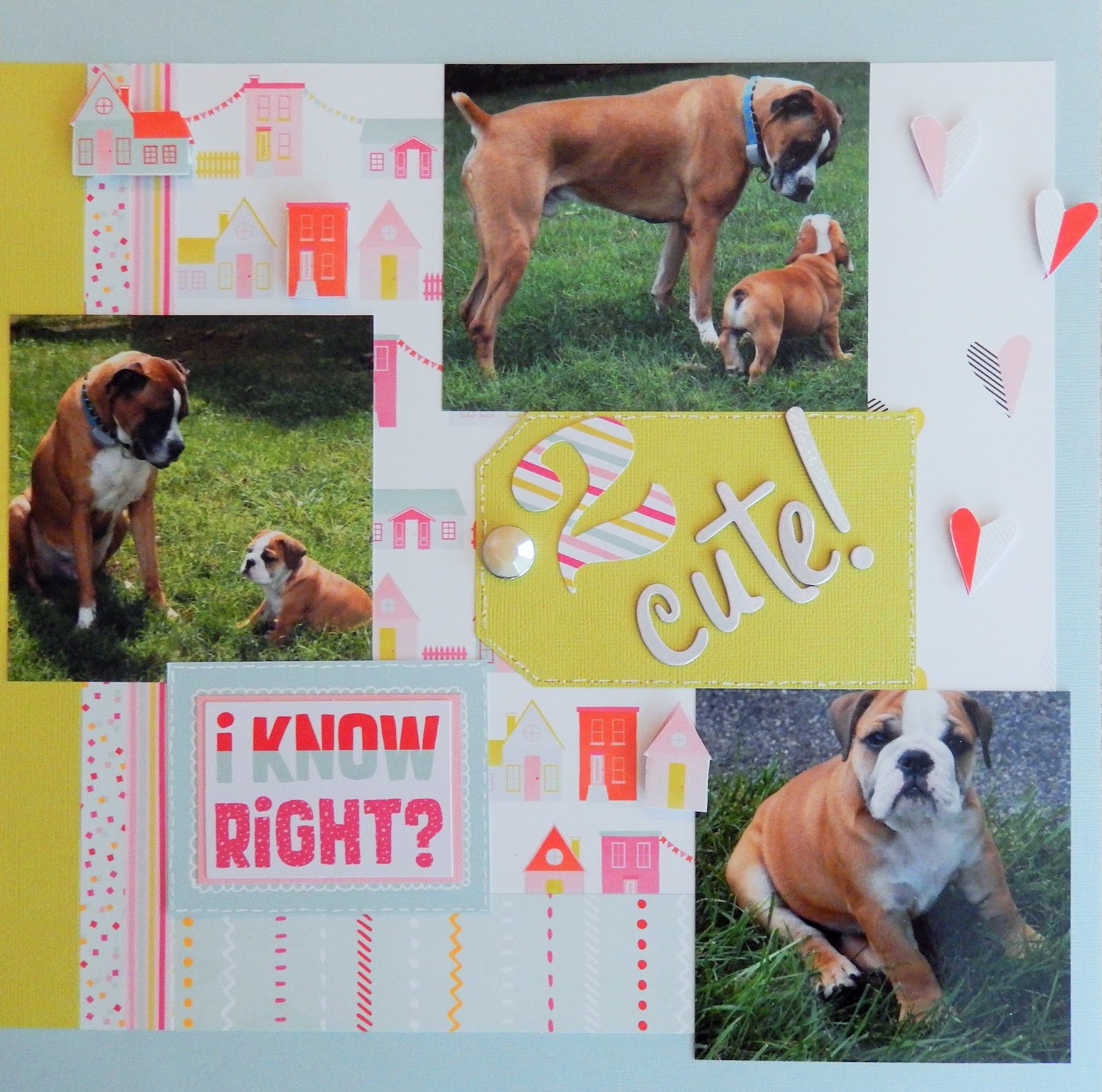
Also, I did take Brenda Carpenter's handcut heart idea and applied it to a different layout that I created with the November 2015 kits:

Have a wonderful day!!!

Tuesday, November 3, 2015

Re-Examining Your Creative Process: Making the Most of Your Patterned Paper

 Today's installment from our re-visited patterned paper series, presents a larger version and lift from Brenda Carpenter's original.  It was created with the November 2015 Flavors of the Month Kit along with the Embellishment and pattern paper add-on utilizing the Bella Blvd. Family Frenzy line. Here is what Brenda said when she created her page:

***Use your leftovers to create smaller layouts and cards.  Here are some examples, (I only found this example in my binder here).  Note how I use the design principles above and in Week 1's lesson on the layout, (edited for just this layout was found.

"Little Dreamers"

  • Photos -- 4 x 6 and 3 x 3.75 inches printed with white borders.
  • Base is yellow 12 x 12 cardstock.
  • Trim 7 various patterns to 1.5 x 7 strips & white cardstock to 1.5 x 8 inches.  Use tone on tones to break up some of the busier patterns. and arrange along left side, as shown.
  • Add title and accents as desired.

Saturday, October 24, 2015

Re-Examining Your Creative Process: Making the Most of Your Patterned Paper


Some of my fondest memories of the first few years after high school involve this group of girls.  It is amazing how quickly you can bond when you're all thrown into a new place and not knowing anybody.  I'll always have a special place for everyone on this page!

The pink and green are our Delta Zeta colors.  When I saw the The ScrapRoom's July 2015 Patterned Paper Kit, (still available BTW), I was hoping to find a picture from sorority to take advantage of the wonderful, bright papers included in the patterned paper kit from the Pink Paislee Citrus Bliss line.

Brenda Carpenter's Patterned Paper Series notes are below:


4. Think 2/3 Pattern to 1/3 Solid.  To maintain a good balance of colors and patterns in your layout, compose the design with 2/3 of the patterned paper to 1/3 of the cardstock.  When doing a 12 x 12 sized layout, trim the paper to 8 inches in length and build your design from there.

Note also the use of the contrasting photo corners, adding impact to the layout and drawing the eye to the photos and away from the "busy" patterned paper. (See #1 from October 13ths post.)

"College Life" [12 x 12 inch layout]  - using notes from Brenda's class adapted for my Pink 
Paislee Citrus Bliss layout.

  • 4.75 x 6.75 inch photo matted in pink cardstock, finished at 5 x 7 inches.
  • Base of layout -- Green cardstock.
  • Trim 8 x 12 inch of pink patterned paper.
  • Trim 6 x 11 inch section of green paper and round edges. ( I actually used 6 x 4 inches.  I cut it as 6 x 3 and 6 x 1 inch, and tucked the edges under the pink to be frugal.)
  • Cut a 4.25 inch diameter circle out of white cardstock for the title.
  • Punch or cut photo corners out of Pink Paislee Citrus Bliss Seeds.
  • Trim 9.75 x 5.75 white cardstock for journal box. Matte with 10 x 6 inch lime green cardstock.
  • I used a die cut for the title circle border.  Brenda instructs to "Create 8 ribbon tabs to border the title circle."
  • Add additional embellishments to your liking.
We are almost half-way through the Patterned Paper Series.  Have you liked it?  Are you using the instructions?  Should I continue?  Thanks, in advance, for any feedback.

Tuesday, October 20, 2015

Re-Examining Your Creative Process: Making the Most of Your Patterned Paper


The photograph of this layout was very difficult to take.  The photographs were developed onto a glossy film and it took a gazillion tries before getting an image without glare. The final result was a photograph taken of the layout in a darker area.  As a result, the colors aren't precisely true to form as I brightened it up the best that I could.  The Pink Paislee Memorandum paper has a deeper light color than it appears here.

Although I like the layout a lot, it doesn't exactly use the same design principles as Brenda Carpenter's.  I ended up lifting her layout this time more than reading through her notes first.  But I will address that more later.  In her sample, your eyes are drawn right to the center because of the patterned paper that she used.  Let's look at what she had to say, shall we:

2. Make the Middle Work for You. Another way to use large patterned paper is to cut it up and use it in the middle of your layout.  Have the design work for you by taking shapes and colors from the papers for your accents. Here I used the circle and star elements for the title block and embellishments.

3. Use Patterned Paper for Your Title.  You can stamp on patterned paper and cut out the letters.  You can also use a die cut tool to create a title with the paper, (see "superstar" card - {which I, Janine, cannot find-so I cannot show it to you}) This is a great way to use up extra scraps of paper and bring another color to the design.

Note the use of the small strip of solid paper to break up the two patterned papers. This principle was first discussed in last week's lesson. Below, (actually above here), is another example of that principle.
------

I would like to address what I did differently and how I believe it impacted the impression on the viewer.  As you look at Brenda's layout, try to notice where your eyes begin and how they move on the page.  Then, do the same with mine.
Here's what happens to me on Brenda's page.  My eye is immediately drawn to the center with the busy patterned paper. I glance at it quickly and move to the title and then the matted photograph to the right, where my eyes linger.  I, then, find myself looking up to the picture at the top.  At the end, my eyes are most drawn to the matted photograph, the highlight of the page.

On my page, all of my eye movements go in the same direction, (counter clockwise), but they start at the matted photograph. I end in the same spot.

Both pages use two visual triangles. (Brenda talked about visual triangles last week.)  Brenda's includes the two pictures and the journal box as one, three stars close together in the center as the second.  My page includes the three photographs as one, and the three black embellishments as the other.  In Brenda's, I find that the focus is left more into the center with a more micro or local approach.  On my layout, I find the focus expanding out to the farther reaches of the page due mostly to the placement of the embellishments.

You can see some great similarities to both of the layouts.  Both layouts bring most of your attention to the matted photograph.  The bold and bright colors surrounding them add to the eye being drawn to these larger photographs. This is, generally, the main feature on each page.  Everything else on either page supports the main feature.  Also, as I mentioned, in both layouts your eyes move in the same direction.

However, there are differences related to the papers, colors and embellishments on each page.  On Brenda's page the bright colors, busy pattern, color play and photograph in motion all have the presence of a lively page.  You imagine her toddler in constant motion and growing bigger with her use of fonts and his poses.  On my "Back to School" page, the boys are posed and subdued.  The added "yay" almost feels sarcastic.  :)  The black letters further add to the lack of festivity of the occasion.  The stars and dots, however, cheer up, (a little), the much more quiet page.

I hope that you are enjoying these series.  I welcome your comments and added observations.  Next week, I will add one more lesson to this series using Pink Paislee Citrus Bliss.  Hope to see you then!

Tuesday, October 13, 2015

Re-Examining Your Creative Process: Making the Most of Your Patterned Paper


My crew, today and everyday.  According to a study done by the Harvard Health Watch, an average American spends 101 minutes per day driving. Not sure what it is for us.  But, being that this is my view of these guys for some portion of everyday, I wanted to document it.

I went back to our paper pattern series to help me with these photos.  Notice the direction that my boys are looking....fairly similar to Brenda's page.  It, generally, looks best when eyes in photographs are looking into the page rather than off page.  One exception may be a contemplative page where thoughts wander.  In that case taking the eyes off page sort of fits.  But, I digress.  Onto Brenda's notes:

(Week Two from her series) 1. Use Patterned Paper as the Page Base. When using a large pattern that covers the entire sheet of paper, one method is to use it as the base for your layout. Because the pattern on the green polka dot is so small, it reads as a solid color on the layout and the photos stand out.  The blue cardstock border adds a pop of color that helps break up the design and put the focus on the photos.  Adding solid cardstock photo corners provides impact to the layout, drawing your eyes to the photos and away from the "busy" background paper.


"My Crew": (12 x 12 inch layout) - using notes from Brenda's class adapted for my Pink 
Paislee Memorandum layout.  One more note regarding my adaptation. Although my triangle base sheet does not necessarily fit the description of a "large pattern" in the way that the initial Fancy Pants sheet does with its' pattern of circles and stars cascading diagonally down, I would consider it busy and bold.  I believe Brenda's rules do apply just as well to such a pattern as this.
  • Photo sizes used -- (measured with white matte from photo paper, starting top left and moving clockwise) 4.25" x 5.75", 4.1" x 5.75" and 4.25" x 5.5"  (Brenda's added circles are 2 inch diameter).
  • Start with triangle paper from patterned paper kit as base.  You will be covering up most of this paper, so make sure you cut out the inside to use on other designs. (I, actually use my cut out piece on my next project for this patterned paper series which will be shown on the blog next Tuesday, October 20th.  It measures 9.5" x 7".)
  • Trim red polka dot paper to 10 x 10.75". (It is the back of the clipboard sheet from the October Flavor of the Month Kit called Cubicle.)
  • Trim blue cardstock to 10.25 x 11 inches and adhere flush with the right edge of the page,
  • Punch or cut photo corners and star out of yellow cardstock.
  • Assemble page as shown.
  • Add title and embellish.
One last tip from Brenda C.: Also note the "rule of thirds" in use on this layout - the two yellw photo corners are balance by the yellow star, and the two circular photos, (note Brenda's example), are balanced by the circular journaling block.  Using embellishments or accents in groups of three really helps balance the design.  The visual triangle is something that "I", (again this is coming from Brenda but I do this often as well), use in practically every layout that I create.

Tuesday, October 6, 2015

Re-Examining Your Creative Process: Making the Most of Your Patterned Paper

I had hoped to move more quickly with this series from Brenda Carpenter's class notes from 2007, "Examining Your Creative Process: Making the Most of Your Patterned Paper".  It was a fantastic class that she ran here when I first started up with Tammy's kits.  I loved my pages and cards from it then; and, I'm enjoying them just as much, (if not more), now.  If you are just joining us in this series, you might want to check the notes from past installments.  There is some fantastic information and terrific pages from Brenda to lift.  I have include the links for the prior installments at the conclusion of this post, or you may pull them all up to scroll by clicking on the "Pattern Paper Series" Label in the sidebar.

Today, includes tips from Brenda C. from the conclusion of working with her first kit collection.  Her notes read, "Use your leftovers to create smaller layouts and cards.  Here are some examples.  Note how I used the design principles above on the layouts and cards below."  I'm pretty sure that she is referring mostly to her note #3 from this section on using small amounts of patterned paper effectively.  You may read more about it from Day 3.  She used those notes to create an 8x8 layout, (Day 4, which I converted to a 12x12), and then the following two cards that I lifted:


I have altered her notes to leave the specific instructions to complete my cards with the Carta Bella Trick or Treat line.

"Keep Your Paws Off! Or Not" card

  • Trim black cardstock to 3 x 6 inches; fold in half for card base.
  • Trim framed cat box from Trick or Treat sheet being careful to leave a black frame evenly on all sides. 
  • Matte the design onto Squash or Amber cardstock.
  • Adhere design to card and add sentiment stickers.


"Halloween October 31st" card
  • Trim pale teal cardstock to 4.25 x 11 inches; fold in half for card base.
  • Trim striped paper to 4.5 x 2.5 inches. Trim harlequin pattern 3/4 x 4.5 inches.
  • Trim and punch black cardstock to 3/4 x 4.5 inches.
  • Adhere a ribbon strip above scalloped border as, shown.
  • Punch or cut photo corner out of orange cardstock and adhere to corner of striped paper.
  • Adhere sticker onto orange cardstock, trim close to outside edges of sticker with straight cuts, matte with black cardstock and adhere to front.


Next installment comes in a week and uses this month's Pink Paislee line, Memorandum.  If you are willing to leave any link-ups to your interpretations in the comments, I would love to see what you create!

Re-Examining Your Creative Process - Day 3
Re-Examining Your Creative Process - Day 4

Saturday, September 5, 2015

Re-Examining Your Creative Process: Making the Most of Your Patterned Paper

Continuing our series from Brenda Carpenter's class notes.  I created the layout above using pictures taken last month when we were in the New England states.  Old Sturbridge Village "depicts life in an early 19th-century rural Village, featuring costumed historians, antique buildings, water-powered mills, and a working farm. You can view antiques, meet heritage breed animals, and take part in hands-on crafts."--from the official Old Sturbridge Village site. The woman in the hat is demonstrating how they dyed the yarn that they made from raw materials like wool and plant dies.

I created the page with two patterned papers and a few die cuts from Jillibean Soup Sew Happy, from the September Doubleshot Kit.  The third patterned paper is the yellow one that actually came from last months Doubleshot Kit, Bella Blvd. Star Student.

Brenda created an 8x8 layout with a collage of pictures, "Love this girl":

  • Photo is a 5x5 inch collage (created in Picasa2)
  • Trim pink cardstock to 8x8 inches.
  • Trim white cardstock to .75 x 5 inches (x2) - punch scalloped border along one strip.
  • Trim red scroll paper to 1.5 x 5 inches. Trim red cardstock to 3/8 x 5 inches.
  • Trim striped paper to 1 x 8 inch.  Use 3 flowers cut out from green floral paper.
  • Punch 2 hearts out of red cardstock.  Use negative portion from the punched cardstock as an accentt on the page.  Cover one heart with glitter.
  • Assemble page as shown.  Round the outer corners of the layout.


Wednesday, August 5, 2015

Re-Examining Your Creative Process: Making the Most of Your Patterned Paper - Day 3

Thank you for your warm wishes for my involvement at The ScrapRoom.  I intend to keep you informed by posting updates with the new ScrapRoom kits, showing you some close-ups of our designers work and helping you "Get More Pages Done" with tips, recipes or challenges.  I'll probably continue to throw in some Sneak Peeks at the end of the month too.  :)

 Today I wanted to continue with the Patterned Paper Series.  For those of you just joining us, Brenda Carpenter ran a series of classes on patterned paper that shared several of her tried and true methods to work with patterned paper.  Every class has at least one good tidbit to consider.  I, personally, have learned a lot from her. Hope you enjoy!

From Brenda Carpenter:
3.  Use Small Amounts of Patterned Paper Effectively.
Sometimes less is more. A standard way to use small amounts of patterned paper effectively is to use small 1/2 inch strips of patterned or solid paper to anchor designs, break up patterns, and add borders to photos.  In this layout the skinny strip of striped paper is the base for the pink cardstock and helps incorporate more colors in the layout. 

Another way to add a little touch of color to a layout without overwhelming the design is to use punches.  The small hearts punched out of the patterned paper are a perfect example of this - well-placed accents of pattern and color.  Punches and die cut machines are great tools for making your own accents.

Here is my lift using Crate Paper Poolside:
Since the photograph that I had of myself from a gazillion years ago was sized funny, I used very unusual measurements.  For today's instructions, I am going to defer to Brenda's instructions as her measurements are much more typical of a photograph that you might consider for this layout.  If you like my color and paper scheme to this layout, I added in items from the August Embellishment Kit and August Patterned Paper Kit, as well as border strips from some of the papers.  I, also, added gold twine and a bit of Stickles on the edges of a couple pieces of ephemera that weren't already outlined. The bow was made from a die cut. Please do not hesitate to ask any questions if I can clarify anything as to this layout. 

I, also, thought that I might share a picture of my layout before I added all of the embellishments.
I, personally, find it a lot easier to heavily embellish a page when the patterns are used in small bits.  I did add the punched pink patterned paper at the base of my picture after I thought that the page could use just a touch more pattern.  Brenda had nicely grounded her photo with the striped paper and I wanted to use a touch of pink.

Without further adieu, here are Brenda's instructions on her layout with customary measurements. Please print these instructions and adjust them with Crate Paper Poolside or some other fabulous TSR kit.
  • Photo is matted 4 x 6 inch, text was added in Photoshop. 
  • Base of layout - Yellow cardstock, add 4 x 12 vanilla cardstock along the right edge.
  • Trim an 8.5 x 8.5 inch square of green floral paper (TIP: make sure that you cut out the inside paper that will be covered in the design. This is a great way to stretch your supplies.  Cut out the flowers to use on your layouts and cards. )
  • Trim pink cardstock to 6.5 x 8 inches.
  • Trim striped paper to 1/2 x 8 inches.
  • Cut out large scalloped and pink decorative pattern from the Cherished sheet of patterned paper add-on.  If you don't have this paper, simply substitute strips of scalloped edged cardstock.)
  • Punch out three hearts from scroll paper and one from red cardstock (I used a Martha stewart crafts heart punch.)
  • Add chipbard accent and ribbon attached with a decorative brad.


Saturday, July 11, 2015

Patterned Paper: Bonus Layout


I had this one photograph of our son, Jason, that has it's own story to tell regarding our tradition of taking our boys to Red Robin when they were young, for their birthdays.  I thought that the Ephemera and papers from American Crafts Dear Lizzy Fine & Dandy would be perfect. Since I did not have the right combination of paper scraps to complete the next installment of our Patterned Paper Series, I went out on my own with today's featured layout.  However, we will continue Brenda's tips in the near future.

Here are the instructions:
  • Fussy cut the outline of your subject leaving a slight border.
  • Balloon paper - 2 x 5 inches and 6 x 9 inches, pink stripe - 4 x 9 inches, red dot - 6 x 1 inch and 3.5 x 1.5 inch.
  • White with pink dot circles - 5 inches, 6.25 inches and 2.25 inches, red cardstock circle mats - 5.25 inches, 6.5 inches and 2.5 inches.  The decorative border strips are 6.5 inches long and 4.5 inches long.
  • Start assembling by placing the large patterned pieces about an inch and a half from the top as shown.  Build on those pieces, all of your cuts as seen in the layout.  Add photograph.
  • Choose ephemera, chipboard, enamel dots any other embellishments and alphabets to fit the theme of your page. I matted my ephemera and attached them with foam adhesive and threads for added dimension and interest.  I, also, printed my journaling on the Fine and Dandy heart paper, cut them as strips and matted them.

Thursday, July 9, 2015

Re-Examining Your Creative Process: Making the Most of Your Patterned Paper - Day 2

From Brenda Carpenter:

2.  Color Blocking with Patterned Paper.  
Using linear blocks of different patterned papers is a quick and easy way to create a basic layout.  Adding solid color blocks (title and journaling tag) helps the layout from being overwhelmed with patterns.

Always pay attention to the "direction" of the pattern paper to help move your eyes across the layout and bring more focus to the photos.  For eaxmple the verticle line of hearts, flowers and stripes all bring your eyes to the main photo in this layout.  Think about what you want for the main focus of your layout and use patterns to help you accomplish this.

Brenda's Original Instruction

Below are my lift and adapted instructions to create the layout with AMERICAN CRAFTS DEAR LIZZY FINE & DANDY.


  • Photo sizes - 4 x 4 (x2) and 3.75 x 4.5 inches.
  • Heart design - 2 x 7 inches, House pattern - 6 x 9 inches, Stripes - 6 x 1.5 inches.
  • Cut the end strips from your patterned papers and use two of them for this layout.  I used the confetti and stripe strips that you see in this layout.
  • I used cardstock from the July 2015 Bazzill/Cardstock kit that were highlighted for the Pink Paislee kit as they also worked well with this kit. One of the many things that I love about The ScrapRoom Kits is that their colors often work so well together.  Trim the Lime cardstock to 1 x 10.5 inches and 4.75 x 3 inches (trim edges to make tag shape for title.)  Arrange on Grey-Blue cardstock and adhere once you have everything lined up well.
  • Fancy cut a few hearts and a few houses to add dimension to your page from their respective patterned papers.
                                       
  • Choose Ephemera and alphabets to fit the theme of your page.  Create a title in the Lime tag, highlight the edges of the tag with some penwork and add a brad or button.
  • Brenda used a TSR stamp to journal on her page where I used Ephemera.  My Ephemera is double matted and doodled.
                                   

 Stamps ($3) from the TSR store that may work are:
  

The first installment to this series may be found here.

Hope you are enjoying this class!  Have a great day!


Thursday, July 2, 2015

Re-Examining Your Creative Process: Making the Most of Your Patterned Paper

If you have been around The ScrapRoom as long as I have, you might remember a class that TSR designer Brenda Carpenter ran.  I happened to come across my printed copy of "Examining Your Creative Process: Making the Most of Your Patterned Paper" and wanted to scraplift every single project that she made for it!

The class has so much good information and great ideas.  Best thing is, everything still looks stylish today.


This class has several step by step projects and lots of fabulous tips.  We are going to run a series on The ScrapRoom Blog starting this month.  I will be sharing Brenda's fantastic ideas and creating projects with current ScrapRoom kits.  Hope you play along!

I'll be starting with the July Main Kit, Embellishment Kit, Patterned Paper Kit and the Cardstock Kit. This series will be a progression, and I will be working just a few steps ahead of you to share how to make pages with the current kits.  Here's a peek at the first one:

Okay,...I'm so excited about this that I'm going to show you one more lift:

I hope that your just as excited about this class as I am.  And, it's free.  So be sure to grab your kits and check back later, (quantities are limited).  I'll post the details to these two around the time that you receive your kits.

The instructions will be easy to cut, paste, print and slip into your kits just like the monthly Double Page Spread Recipes.

Are you ready to "Get More Pages Done"?