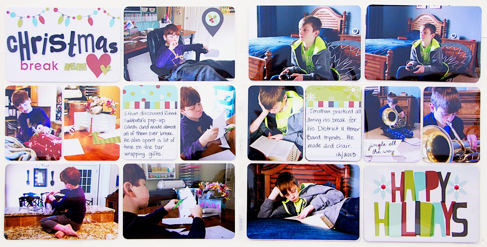
As you can see, the pictures are not exactly Christmas pictures. Instead, they focus on how my two boys spent their time during their break from school. The colors in the pictures were not quite Christmasy either, so I chose cards that had a white background to them. This made the page seem a little less busy.
For my title card above, I grabbed all of the black Thickers in my stash. Mostly because I wasn't sure if I had any s's or t's left in any of them. While all the letters were sitting there, I had the idea to create the title out of a mixture of different fonts. Since the papers are a bit whimsical, the letters fit right in. I think the fact that all the letters were black helped, too.
I also wanted to point out a tip for using the Simple Stories 2x2, 3x3, and 4x4 cards from the kit. I cut one down to use as the striped border pieces on my journal cards. Another I trimmed down to create a banner to attach to a picture.
Well, that's all I have for today. I hope you are enjoying your kit and your holidays!


No comments:
Post a Comment