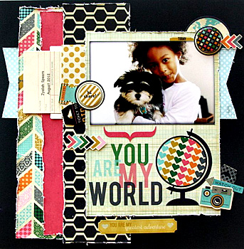
Our final July sneak peek comes to you from designer, Lea Lawson and the My Mind's Eye blog. The final layout kit in the July Flavors of the Month Kit will be My Mind's Eye's new Ashbury Heights line. You're going to love the color palette and the GOLD accents in this upscale line. Watch the website at www.scrap-room.com tonight for the full reveal of all of our July Kits!
Monday, June 30, 2014
Sunday, June 29, 2014
July Sneak Peek #5
I love this brand new line, Under The Stars, from Simple Stories. It is full of rustic goodness and will be featured in our July Doubleshot Kit. Today's sneak peek layout, by Simple Stories designer, Wendy Antenucci, and featured on the SS blog, shows off the great style and colors in this line. You are definitely going to want to add one of the July Doubleshot Kits to your July shipment if you are not already a member of this club. TSR members can just shoot me off an e-mail at admin@scrap-room.com to add this kit to your already-scheduled shipment!
Saturday, June 28, 2014
July Sneak Peek #4
Sneak peek #4 gives us another look at one of the amazing July Flavors of the Month Kit lines - Bella Blvd. Family Forever. With Bella Blvd., we always get clean lines, graphic elements and fun color combos, and this layout by Bella Blvd. designer, Kay Rogers, gives us a great look at Bella's classic style. This is going to be a fun kit!
Friday, June 27, 2014
July Sneak Peek #3
For our Doubleshot Club members, it's time for a little sneak peek of one of the July Doubleshot Kit lines - Summer Squeeze by Bella Blvd. Today's layout was created by Bella Blvd. designer, Wendy Antenucci and taken from the Bella's blog. This kit is going to be a blast to work with!
Thursday, June 26, 2014
July Sneak Peek Week #2
Today's sneak peek was spotted on the Teresa Collins Designs blog and features a "peek" at a mini-book created by Teresa Collins herself, showcasing her new Daily Stories collection. Yes, this fun line will be appearing in our July Flavors of the Month Kit, but you'll have to wait until the 30th to see exactly what papers and embellishments are coming your way - fun stuff!
Wednesday, June 25, 2014
July Sneak Peek Week Begins!
Sneak Peek Week kicks off with this lovely layout by Simple Stories' designer, Heather Leopard, selected from Simple Stories' blog and showcasing their DIY product line. The Simple Stories DIY line will be appearing in your July Flavors of the Month Kit, along with three other gorgeous product lines from your favorite manufacturers! Stay tuned for another sneak peek tomorrow!
Tuesday, June 24, 2014
Project Life Inspiration: Layout of the Day!
Project Life Layout of the Day by Aphra Bolyer, using the Jillibean Soup Spicy Social Soup cards and elements from the June Project Life Kit. (Our June Project Life Kit is sold out; be sure to e-mail me at admin@scrap-room.com to get your name on the list to receive the July Project Kit before it's sold out!)
Monday, June 23, 2014
How Do You Store Your Paper?
Hello Crafters! It's Rochelle here and I want to know… How do you store your paper? To answer this question, I suppose you would first ask have to ask yourself how you scrapbook, right? Do you like to mix manufacturers? Do you like to scrap by color? Or, do you prefer to scrap by collection or theme? The answers to these question will help you figure out the best storage method for you.
For me, I "think in collections" most of the time, so I keep my collections together, including the coordinating embellishments, for the most part. I use Iris containers to store my collections and each Iris container is sorted by theme rather than by manufacturer. I find this is the best way for me to sort and store my papers because I start my layouts with photos, and the photos tell me which Iris container I need to go to, according to the photo "theme.".


Before this system, I had my papers sorted by manufacturers. The problem is that I would forget about some really great collections for a specific theme because I would be tempted to go to my “favorite” manufacturer and choose something from that Iris container. Now, with my current system, I have discovered that I save a lot of time searching for paper because I know which Iris container to go to for the best selection of collections to go with a particular photo theme. Some examples of the themes for my Iris carts are Girl, Boy, Masculine, Feminine, Shabby chic, Vintage, School & Pets (combined because I have fewer collections in these themes), Fall, Summer, Celebration, Family/life, and Everyday.
So that is how I store my paper! What about you? I would love to know how you sort and store your papers! Please leave a comment and let me know! :)
Thank you for stopping by today! :)
~Rochelle
Friday, June 20, 2014
Weekend Inspiration: Quick and Easy 2-Page Layouts!
We've made it super-easy for you to create great two-page layouts with our Flavors of the Month Kit at The ScrapRoom. Everyone who purchases our Flavors of the Month Kit receives access to (4) downloadable Recipe Cards - your guide to creating (4) great two-page layouts. Each Recipe Card highlights one of our (4) monthly layout kits and features a full-color photo, along with cutting and assembly directions. So, take your pick from the (4) June Recipe Cards and set aside an hour to preserve some of your favorite photos this weekend!
June Recipe Card layout by Brenda Ragsdale
featuring the Fancy Pants As You Wish layout kit
June Recipe Card layout by Rochelle Spears
featuring the Jillibean Soup Sightseeing Stew layout kit
June Recipe Card layout by Brenda Carpenter
Thursday, June 19, 2014
Off-Topic with Tammy
Good Morning! One of my goals this summer is to try new recipes with new vegetables. I've always liked veggies, but after 42 years of cooking frozen veggies in the microwave and adding salt, pepper and butter, I'm on a mission to make vegetables the best thing about dinner! On a friend's recommendation, I grew some Swiss Chard for the first time last summer. I'd never had it before, but she swore that it was good and easy to grow. As a novice gardener, that was enough to encourage me to give it a go. Well, she was half right; it was easy to grow, and I was swimming in Swiss Chard, along with lettuce and spinach. But, it was not nearly as good as my lettuce and spinach (strong flavor), and I knew I wasn't likely to eat it in a salad when I had these other lovely greens also available to me. So, what was I going to do with all of this chard?
In walks Lori. While we were both working at the gardens one afternoon, she told me how her family eats chard, and that they love it and eagerly wait for every new cutting of chard to make this tasty dish. So, I immediately went home and whipped it up, and IT WAS AMAZING! Consequently, this year, like Lori, I have been eagerly waiting for my chard to be ready so I can make this dish again. We had it two nights ago, I ate the leftovers for lunch yesterday, and we're having it again this weekend. I think I could eat it every day for two weeks straight, but the fam probably wouldn't go for that, so I'm spreading it out every few days and enjoying this year's harvest with an exceedingly happy heart.
So, if you're looking for a delicious way to feature a new and good-for-you vegetable, give Swiss Chard and Lori's SWISS CHARD BACON PASTA TOSS a try. It's a super-fast dinner that will make you want to grow your own crop of chard next summer!
SWISS CHARD BACON PASTA TOSS
6-7 pieces of bacon, cooked and crumbled
1-lb. bowtie pasta
15-oz. can white beans (S&W brand preferred)
Swiss Chard (big colander full of leaves), washed and torn into bite sized pieces)
Grated Parmesan Cheese
Cook pasta. Fry bacon in a skillet. When almost crispy, add Swiss chard, stirring until all chard is wilted and bacon is crispy. Add canned beans ( DON'T DRAIN). When pasta is al dente, drain and place in a serving bowl. Pour bacon/chard mixture over pasta and toss. Top with grated Parmesan cheese and serve.
Wednesday, June 18, 2014
Daily Inspiration: Layout of the Day!
Layout by Brenda Ragsdale
featuring the Jillibean Soup Sightseeing Stew layout kit from the June Flavors of the Month Kit
Tuesday, June 17, 2014
Project Life Inspiration: Layout of the Day!
Project Life Layout by Aphra Bolyer
Fancy Pants As You Wish products from the June Project Life Kit
(Our June Project Life Kit is sold out, so if you're a Project Life scrapbooker and are looking for a great variety of supplies for your layouts, be sure to get your name on the list today to receive our upcoming July Project Life Kit - lots of variety; one low price!)
Friday, June 13, 2014
Weekend Inspiration: "...Get More Pages Done!"
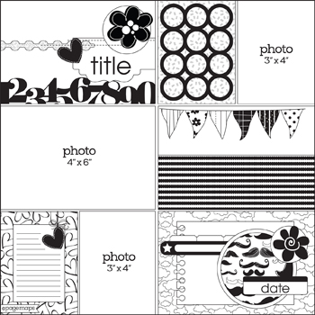
I love to send you into the weekend with a little extra inspiration and a challenge to pull out those supplies and create a page or two. This weekend, our focus will be on our monthly sketch. Each month, we feature a sketch and a couple of examples of layouts that were created based on the sketch. This month's sketch features the "pocket scrapbooking" style, and even if you aren't a "Project Life" scrapbooker, you can mix it up in your traditional scrapbooks with an occasional pocket-style page.
Your challenge this weekend is to create a layout based on the monthly sketch. You can use any supplies you have on hand, and your layout can be exactly like the sketch or loosely based on the sketch. You don't even have to use the pocket protectors; you can simply add the photos and embellishments in the grid style on top of a regular piece of 12x12 cardstock to get the same look. Give it a go and see how you like it!
Your challenge this weekend is to create a layout based on the monthly sketch. You can use any supplies you have on hand, and your layout can be exactly like the sketch or loosely based on the sketch. You don't even have to use the pocket protectors; you can simply add the photos and embellishments in the grid style on top of a regular piece of 12x12 cardstock to get the same look. Give it a go and see how you like it!
June Sketch by www.pagemaps.com
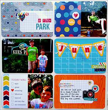
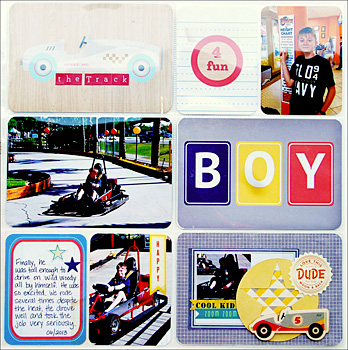
Layouts by Aphra Bolyer, featuring the June Project Life Kit
Thursday, June 12, 2014
Off Topic with Tammy
This year marks the end of our family's 9-year stint in our neighborhood middle school, Stephen Mack Middle School. We have loved our time here. The teachers and principals have taken the time and energy to get to know our boys, and they have prepared them well for high school academics. We are grateful for our 9 years here. On Josiah's last day, we sent in some homemade kettle korn for the teachers and staff, and I packaged it in a cardboard box, decorated with scrapbook paper, simply taped to the sides of the box. I added an extra sheet of paper taped to a paint stick that I attached to the back of the box so it stood over the popcorn bags. I added some popcorn bags and a cup for scooping, and here's the best part - I asked my boys to all sign the box with a note of thanks. I thought they'd just write a generic "Thank you" sentence, but their notes far exceeded my expectations. All four sides of the box were covered with heartfelt sentiments of gratefulness. I hope that the teachers and staff felt as appreciated as we intended them to feel.
I'm sharing this idea because I thought it ended up being a fun way to package an inexpensive food gift. I didn't realize when I was putting it together that it would turn into a giant 3-dimensional "Thank You" card, but I loved the end result - personal notes of appreciation packaged together with a yummy treat, made to feed a crowd!
(Sorry the above photo is a little grainy, but I'm posting from my iPad on vacation, and my photo-editing software isn't as good as what I have on my computer!)
Wednesday, June 11, 2014
Daily Inspiration: Layout of the Day!
Layout of the Day by Rochelle Spears
featuring the Fancy Pants As You Wish Layout Kit from the June Flavors of the Month Kit
Tuesday, June 10, 2014
Project Life Inspiration: Photo Embellishing
This month as I worked on my Project Life pages, I realized that I had a ton of photos from last June. After sorting through them to decide on my pages and pairing down the photos that I didn't want to include, well, I still had a lot. Rather than cull them down some more, I decided to include them all. However, I didn't want to have pages that are full of photos with no embellishments. No, I love embellishments and layers way too much for that. The result? Embellished photos.
I have included several examples of these embellished photos from my June layouts. Hopefully, you will be inspired to add even more paper, stickers, and tags to your Project Life pages. It really isn't that time consuming once you get the hang of it. Here are a few techniques to get you started.
Paper strip and stickers: On this photo, I cut a 1 x 6" strip of paper and adhered it straight on top of my photo. This gave me a perfect spot to layer two coordinating stickers. This is a great technique for pictures that have a lot of white or negative space on them.
Pennants and Charms: For this next photo, I added two 1/2" by 1" and 1.25" pennants that I cut from scraps. I added a 3/4" circle to ground my KI Memories Icicles dimensional camera. Again, you want to find a photo that has a good bit of negative space.
Mini Layout: For this technique, I cropped my photo and matted it on white cardstock. This allowed me to treat my pocket as a mini layout. To embellish, I added a few stickers. This works especially well for the large 4x6 pockets and with multiple photos as well.

Stickers: For this photo, I added several layers. First, I added a label sticker, then a piece of patterned paper trimmed to fit the sticker, then a phrase sticker that I cut in half, and finally two small star stickers. I love how the embellishments really draws your eye down to the photo, which is one of my favorites on that layout. The second photo is a simpler version, just two stickers layered on top of each other in a corner of the photo.
These techniques really helped my pages feel more unified and finished. Not to mention, I used up more of Tammy's fabulous kits!
Thanks for popping in. See you next month!
Monday, June 9, 2014
Daily Inspiration: Layout of the Day!
Good Morning, Friends! I apologize for the blog silence this weekend. My family is currently traveling on vacation - celebrating my husband's wonderful parents' 50th wedding anniversary and then on to see some amazing sites in Utah and southwestern Colorado that we haven't yet seen! I managed to get all of the June kits invoiced, packaged and shipped out before we left, but I was cramming about three days worth of work into one day this month, and I just ran out of time before I could get the blog posts set up for the week. The anniversary party is now over, and I have found an internet connection, so I'll try to get back on track this week.
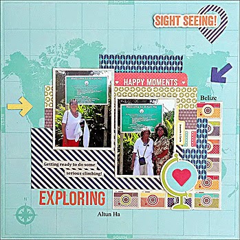
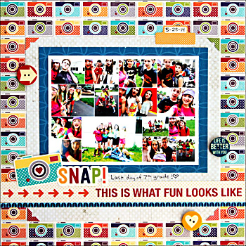
Hopefully, you'll be able to find a snatch of time for a little scrapbooking today. If so, why not find some creative inspiration from the layout below, created by TSR Designer, Brenda Carpenter. This one-page layout is colorful and fun and would only take about 15 minutes to recreate with a favorite 5x7 photo and the Jillibean Soup Sightseeing Soup Layout Kit from the June Flavors of the Month Kit. And, let's face it, using that sheet of "camera" paper will absolutely make you happier today!
Hopefully, you'll be able to find a snatch of time for a little scrapbooking today. If so, why not find some creative inspiration from the layout below, created by TSR Designer, Brenda Carpenter. This one-page layout is colorful and fun and would only take about 15 minutes to recreate with a favorite 5x7 photo and the Jillibean Soup Sightseeing Soup Layout Kit from the June Flavors of the Month Kit. And, let's face it, using that sheet of "camera" paper will absolutely make you happier today!
by Brenda Carpenter
Kits Used: June FOTM Kit and June Embellishment Kit
Wednesday, June 4, 2014
June Doubleshot Kit
June Doubleshot Kit
Jillibean Soup Spicy Social Soup
Imaginisce Perfect Vacation
Layout created by Brenda Ragsdale, using the JBS Spicy Social Soup layout kit in the June Doubleshot Kit. Visit our Doubleshot Kit Idea Gallery for more great layout ideas!
Tuesday, June 3, 2014
June Project Life Kit
Today, we're taking a closer look at our June Project Life Kit. Our monthly Project Life Kit features products designed for pocket scrapbooking - 4x6 and 3x4 cards, along with smaller and flatter embellishments and journaling and labeling pieces. Each month, we give you (4) different lines that include enough products to complete at least a 2-page spread with each line (generally more). When possible, we try to coordinate the Project Life Kit lines with the lines in the Flavors of the Month Kit and/or the Doubleshot Kit to give our customers maximum flexibility! Click HERE to view the detailed list of the kit contents.
June Project Life Kit:
Crate Paper Boys Rule
Fancy Pants As You Wish
Jillibean Soup Spicy Social Soup
Simple Stories Everyday Sn@p!
Here's a peek at a 2-page pocket layout, created by Aphra Bolyer, using the Simple Stories Everyday Sn@p! cards and stickers in the June Project Life Kit. See more great pocket layout ideas using our June Project Life Kit by visiting our June Project Life Idea Gallery!
Monday, June 2, 2014
June Kits are LIVE!
Our June 2014 Kits are LIVE and available for purchase at www.scrap-room.com. Our Flavors of the Month Kit is only $23.95 for members and includes all of the products you see below - enough goodies to complete 8-12 (12x12) pages each month! That is the absolute best value in the kit club world!
Be sure to visit our Idea Gallery for fabulous layout and card ideas that you can create with our kits!
JUNE 2014 Flavors of the Month Kit:
Jillibean Soup Sightseeing Stew
Fancy Pants As You Wish
Crate Paper Boys Rule
KI Memories Playlist
And, coordinating with our June Flavors of the Month Kit...
June 2014 Embellishment Add-On Kit
June 2014 Patterned Paper Add-On Kit
June 2014 Cardstock Add-On Kit
June 2014 Stamp Add-On Kit: Jillibean Soup Spicy Social Soup Stamp Set
Subscribe to:
Comments (Atom)


