Onederful You by Brenda
Saturday, June 30, 2012
Friday, June 29, 2012
July Sneak #5
Loving the Sunshine by Aphra Bolyer
Such sunny, happy paper, right? And how about that crocheted flower? Oh yeah . . . it comes in the July Flavors of the Month kit! Any guesses to the name of this one?
Thursday, June 28, 2012
July Sneak #4
Summer Joy by Jenny
I see some scrap lifting in my future . . . what an amazing use of diamonds!!! And sooo many fabulous patterns on this layout. The only one I don't see is paisley. Any guesses as to what line this is???
Wednesday, June 27, 2012
July Sneak #3
Chapter 1 by Melanie
What a sweet story to tell? And what sweet paper!!! Any ideas what line is the first in the July Flavors of the Month kit???
Tuesday, June 26, 2012
July Sneak #2
Do You Remember? by Guest Designer
Another bright and sunny line perfect for Summer will be included in the July Double Shot. Any ideas???
Monday, June 25, 2012
First JULY Sneak!
Hey! Is that Grandma in a Swimsuit?
by Theresa
How amazing is that border??? So fresh! Any ideas what line this is? Hope you like it because it'll be in the July Double Shot.
Saturday, June 23, 2012
June Page Starter Verison 2
Last week I introduced the June Page Starter and showed you my sample layout. Today, I have another version to share. One with brighter colors and a little more whimsical feel. Here, take a look.
Swim Lessons
For this layout, I used the Fancy Pants Summer Soul Page kit that comes in the June Double Shot and 4 2" x 3" photos mounted together. To give this layout a little more whimsical feel, I turned the large 5.5" circle into a sun by adding 1" and 2" notched paper strips as rays. The yellow paper is actually from the May Fancy Pants Be You page kit. LOVE that the colors work so well with this month's kit.
I decided to anchor my title right onto the sun. The blue chipboard alphas are Thickers that I had in my stash and the October Afternoon Orange Mini Market Alphabet Stickers came in the May Venti kit. My original idea was to curve the title along the edge of the circle, but that didn't work so well with the rays. I might just have to do a third layout, so I can create a title around the circle. LOL!
To create my embellishment cluster, I cut two surf boards from the Fancy Pants Beach Towel patterned paper and then layered on three of the Elements Stickers, a button, and some twine. You can see in the picture below that I created dimension with pop dots and clear dots.
So, have you completed a layout with the June Page Starter formula yet? If so, be sure to link up to the original post HERE by midnight on Saturday, June 30th to be eligible to win a $10 gift certificate to the TSR store. Happy scrapping!
Tuesday, June 19, 2012
Tuesday Tutorial: Bazzill Perfectly Pleated Strip Flower
This month's Embellishment Add-On included a 12" pleated newsprint paper strip by Bazzill. I just love it! So much, in fact, that I decided to create a card with it as the main embellishment.
Today, I thought I'd share with you how to create a flower out of your Bazzill Perfectly Pleated 12" Strip. It is super easy, and really makes for a nice embellishment.
First, you will need to adhere the two ends of your strip together to create a circular band. Like this.
Next, punch out a circle. Mine is 1 7/8" in diameter. Cover the circle with lots of adhesive. Fast drying liquid adhesive or a hot glue gun works best. Then flatten the center of your band down onto your circle and place your punch on top of it until it dries and looks like this.
Add it to your card and top with a large Jillibean Soup chipboard acrylic button tied with a strip of ribbon. This is also a great place for a couple of the stick pins from this month's kit.
I hope you enjoyed this tutorial! Leave me a comment with a link to your project if you give it a try. I'd love to see!
Monday, June 18, 2012
6 Reasons Why You Don't Need A Silhouette... says Theresa
6. Dude, seriously. You do not need to match your title font to your
journaling font. What, do you match your socks to your shirts, too?
5. Okay, but that's too much work. Type, drag to change size... uh... wait. That's it? Well, never mind that. My point is that making your own titles is tough. If only you could just download them or something...
4. You have to download and use somebody else's designs. There are only a few, I'm sure. Not including all those .bmp and .jpeg files you can find on the internet. Or the free ones that people make and share... Oh. You can make your own? Never mind.
3. That's such a waste of paper! You cut out your title, and you get left with completely useless scraps. Not like alpha stickers. Those are perfectly proportioned every time.
2. I can do anything the Silhouette can do with my punches. Well. As long as there aren't a bunch of perfectly lined up ones... and they've got enough reach.
1. I have so many embellishments that I would never need to create one. I have them in just the right size, color, and style. Every time. Well, most of the time. Actually, if I dig hard enough, I can find something that works eventually.
Okay. So I guess it's really 6 reasons why you *do* need a Silhouette! And here's one more to sweeten the deal: How about a pattern for free? Here's the pool table I designed as shown on the mini cover in reason #4 above. Download and enjoy!
 |
| Impact font |
5. Okay, but that's too much work. Type, drag to change size... uh... wait. That's it? Well, never mind that. My point is that making your own titles is tough. If only you could just download them or something...
 |
| Happy Birthday by Hero Arts |
4. You have to download and use somebody else's designs. There are only a few, I'm sure. Not including all those .bmp and .jpeg files you can find on the internet. Or the free ones that people make and share... Oh. You can make your own? Never mind.
 |
| Pool table and rack design by Theresa Sovacool |
 | ||||
| Hello Sunshine by k.becca |
 |
| Butterflies by Karla Dudley |
 |
| Fishing Charms by SnapDragon Snippets LLC |
 |
| Fish by Hero Arts |
 |
| Daily December Numbers by Lori Whitlock |
 |
| Wave In Circle by Sarah Bailey |
Okay. So I guess it's really 6 reasons why you *do* need a Silhouette! And here's one more to sweeten the deal: How about a pattern for free? Here's the pool table I designed as shown on the mini cover in reason #4 above. Download and enjoy!
Friday, June 15, 2012
June Page Starter!!!
Last month, we started a new feature here on the blog, our Page Starter challenge. And guess what? It's time to do it again!
Remember, each month I'll post the directions to get you started on a scrapbook layout. I'll show you an example and then leave you to finish it up with whatever photos, papers, and embellishments work for you. That's it! Here's this month's starter.
Here's what you'll need to get started. First, you need a background piece. I chose to use a patterned piece rather than cardstock because the June kit is chock full of papers that work for the background. You'll also need four more patterned papers cut to the following dimensions:
1. 5.5" circle
2. 3.5" x 10" strip
3. 1.5" x 10.5" scalloped strip
4. 1" x 11" notched strip
Now you're ready to start adhering the paper to the page. Here are the directions for placing the patterned paper.
- Adhere the 3.5" x 10" strip 6" from the top and flush with the right edge of the page.
- Adhere the scalloped strip right beneath the first strip flush with the right edge of the page.
- Adhere the circle 2" from the left edge and 2.75" from the top edge of the page.
- Adhere the 1" strip flush with the right edge and over the seam of the previous two paper strips.
Finally, you will add your photos and embellishments. This part is completely up to you. There is no set limit to the number of photos or no set placement for them. Also, you can use whatever embellishments you like, wherever you want to place them on the layout.
Here's one way that you could finish the June Page Starter. For this layout, I used Bazzill Vintage Marketplace papers and two 3" by 5" vertical photos.
It's All About the Bunnies
I'll be back in a week or so to show you another finished layout. In the meantime, I'd love to see what you do with the June Page Starter. Link up your completed layout to the bottom of this post by Saturday, June 30th for your chance at a $10 Gift Certificate to the TSR Store.
Happy Scrappin!
Thursday, June 14, 2012
Card Class: Father's Day
Father's Day is just a few days away -- THIS Sunday, June 17th. Yikes! Grab your kits and whip up an awesome card for the Dads in your life. Here are some great ideas from the design team.
Happy Daddy's Day by Jenny
Cool Dad Gift Tag by Melanie
Happy Father's Day by Melanie
Father's Day 2Day by Theresa
Dad, You Rock by Aphra
As you can see, the June kit is just perfect for creating a masculine card. There's Simple Stories Awesome and Bazzill Wayfarer. And with so many fabulous embellishments to choose from, it shouldn't take you any time to whip one together. Pop a gift card inside and you are all set!
Happy scrapping!
Wednesday, June 13, 2012
Camp Scrap 2012 by May Flaum
Camp Scrap 2012 by May Flaum!
The ScrapRoom is an official sponsor of May Flaum's 2012 Camp Scrap - a two-month long adventure in scrapbooking! I think our layout kits are the perfect compliment to bite-sized daily bits of Camp Scrap inspiration and use-it-up challenges. Be sure to head over to her blog to get in on all of the festivities this summer!
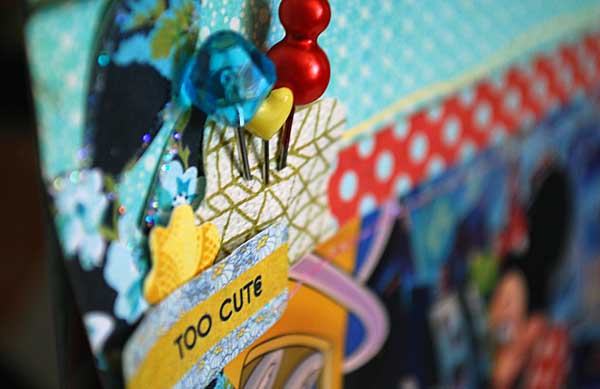
The ScrapRoom is today's featured Camp Scrap sponsor, and May used our June Kits in today's Camp Scrap post. She created a sketch from her layout and used the sketch to create a card. Check out the photos below to see how the sketch transfers from layout to card. Very cool! (All photos and content in the rest of this post comes directly from May's Camp Scrap Post today! Be sure to jump over there to join in on the fun today and all summer long!)
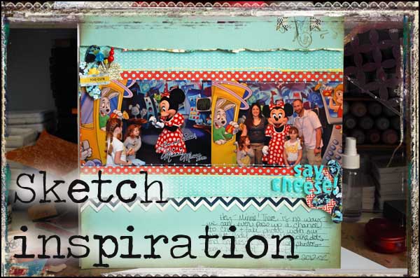
While I don’t use sketches much anymore, I actually do use them quite a bit.
Wait – what?
What I mean is, there are basic blueprints in my mind that I know work, that I know I can utilize my 4×6 photos with for scrapbooking and that I can customize for my stories. Today I want to share a favorite sketch with you – and show you how I used it on a card too.
This sketch as you can see has very little to it.
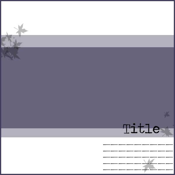
This is because depending on my photos, my papers, and my story I can edit it to make it work for whatever I happen to be working on at the moment.
Here I have used this sketch with a ScrapRoom page kit:
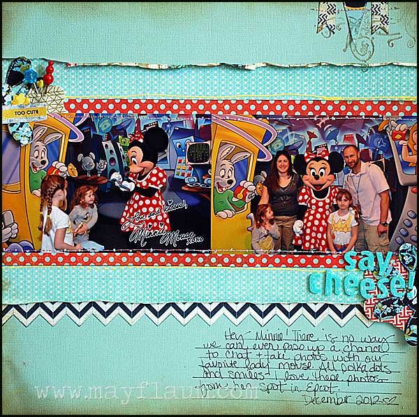
I really like the bite sized kits (perfect inspiration for a page or two!) – and with just added touches I really like how this layered page came out.
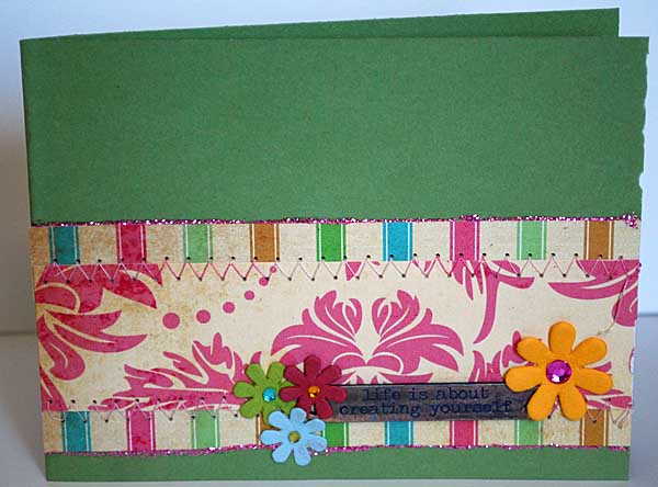
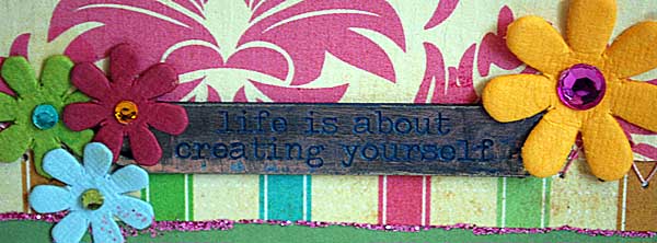
I’m super inspired to try and use more of my page sketch designs onto card format – I really like how this one came out!
Happy Crafting!
Tuesday, June 12, 2012
Tuesday Tutorial: Altered Frame
Hello everyone!
Jenny here to show you all how to make a cute little altered picture frame using the Basic Grey PB & J collection from the June 2012 kit.
I L.O.V.E. this collection because it can basically go with any kind of pictures. I used the majority of this part of the kit to make a couple of Disney themed pages, but I used the leftovers to create this altered picture frame.
I placed the frame with a couple of vases from IKEA that I already had, as well as a decorative ball that I already had..and voila! Instant home decor setting! This is now sitting on my fireplace mantle.
You want to know the best part???? It only cost me $1!!!! Here's what I did:
My mind is already swimming with gift ideas and more home decor items! There are SO many great free printables out there...just Google what you're looking for, or search for free printables on Pinterest, and you will find tons. Using up kit leftovers to create these little inexpensive items is perfect for the budget, AND it helps you use up those leftover pieces that we all can't seem to part with. ;) I can't wait to make up some more of these for gifts!
Jenny here to show you all how to make a cute little altered picture frame using the Basic Grey PB & J collection from the June 2012 kit.
I L.O.V.E. this collection because it can basically go with any kind of pictures. I used the majority of this part of the kit to make a couple of Disney themed pages, but I used the leftovers to create this altered picture frame.
I placed the frame with a couple of vases from IKEA that I already had, as well as a decorative ball that I already had..and voila! Instant home decor setting! This is now sitting on my fireplace mantle.
You want to know the best part???? It only cost me $1!!!! Here's what I did:
- I bought the plain wooden frame at JoAnn craft store in the $1 section.
- I painted the outside edges and the inside edges of my frame with white paint just to make it look more "finished."
- I used Mod Podge to cover the frame with the chevron patterned paper from the Basic Grey collection. (I used Mod Podge to glue the paper down onto the frame, and I also put a layer of Mod Podge on top of the paper to secure it.)
- I already had some yellow/gold felt on hand, so I used it to create the flower. You can find a great tutorial on how to make a flower like that here. I then hot glued a button to the middle of the flower and then hot glued the flower to the frame.
- I went to this blog and downloaded the FREE "Keep Calm" prints. They come in lots of colors (how cool is that?!), but I printed out the one in "sky" color.
- I placed the print into the frame, and it was complete! :)
My mind is already swimming with gift ideas and more home decor items! There are SO many great free printables out there...just Google what you're looking for, or search for free printables on Pinterest, and you will find tons. Using up kit leftovers to create these little inexpensive items is perfect for the budget, AND it helps you use up those leftover pieces that we all can't seem to part with. ;) I can't wait to make up some more of these for gifts!
Friday, June 8, 2012
Trendspotting: Washi Tape
O Washi, O Washi...I think I love you. Seriously, I might just love it as much as twine. I love how Tammy has so many options in The ScrapRoom store...check it out:
I may have gone a bit crazy with washi this month :). It is just the perfect little extra touch....plus I can sew through it!!!
Now...don't panic if you don't have any washi because in this month's kit there are washi-like Simple Stories stickers...whoo hoo! I tore mine a bit on the edges to look like I ripped the "tape".
The multi-color roll I used in two of my layouts is from Smash (I LOVE it), but currently Tammy is sold out. Don't worry because I posted lots of other options above, which are available and just as awesome. Since I have them all be prepared to keep seeing them.
I can't wait to see your layouts and cards with washi tape or stickers!
Melanie
Subscribe to:
Comments (Atom)


